STOKED
A board sports association.
01
Built for the outside
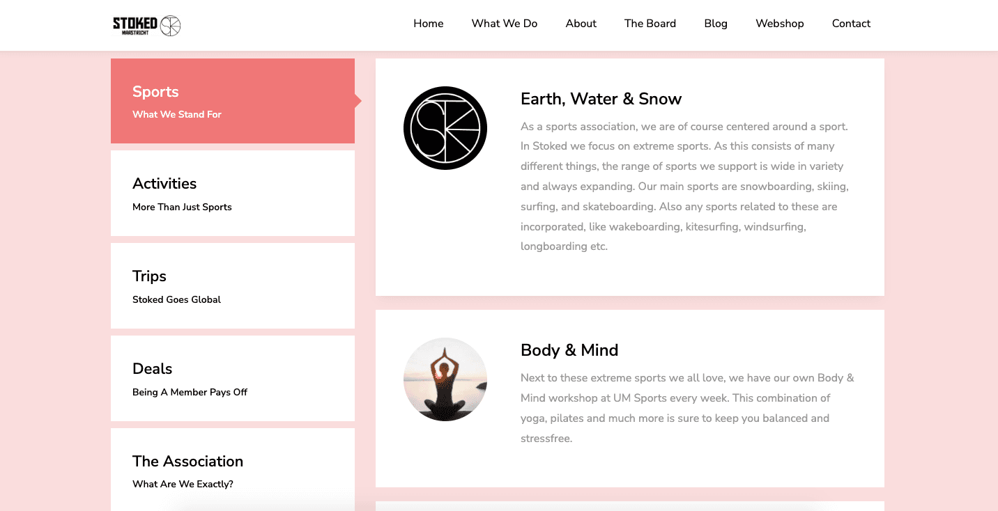
Stoked's identity is designed around momentum, community, and the shared energy of board sports. The system gives the association a bolder, more flexible presence for member communication, events, and the everyday culture of the club.
02
A new visual identity
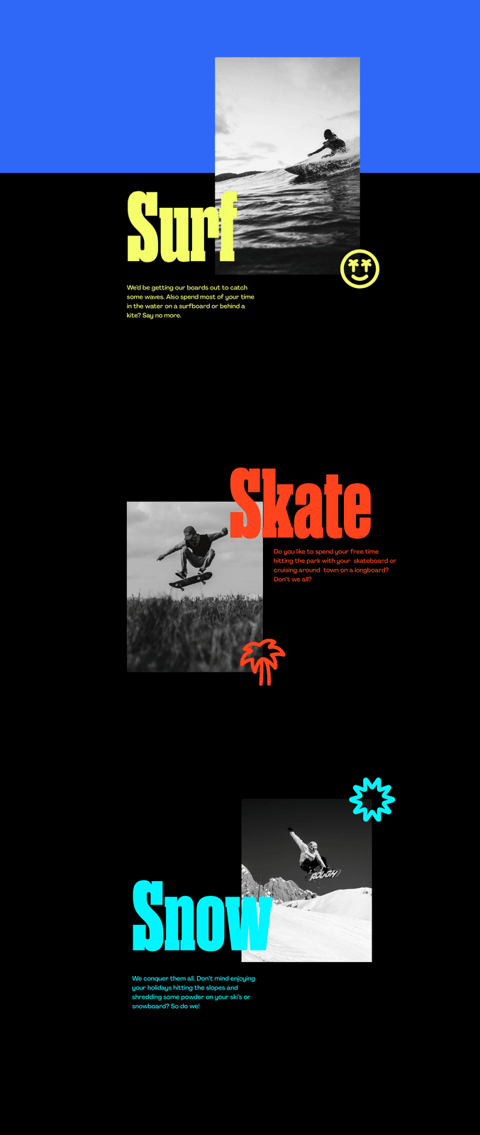
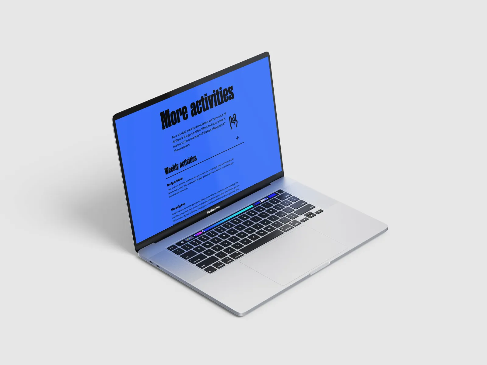
The new visual identity for Stoked represents the core values of the association and establishes a unified visual language that strongly connects with its target audience. It features a vibrant colour palette, exuding energy and youthfulness.
03
The Rebranding
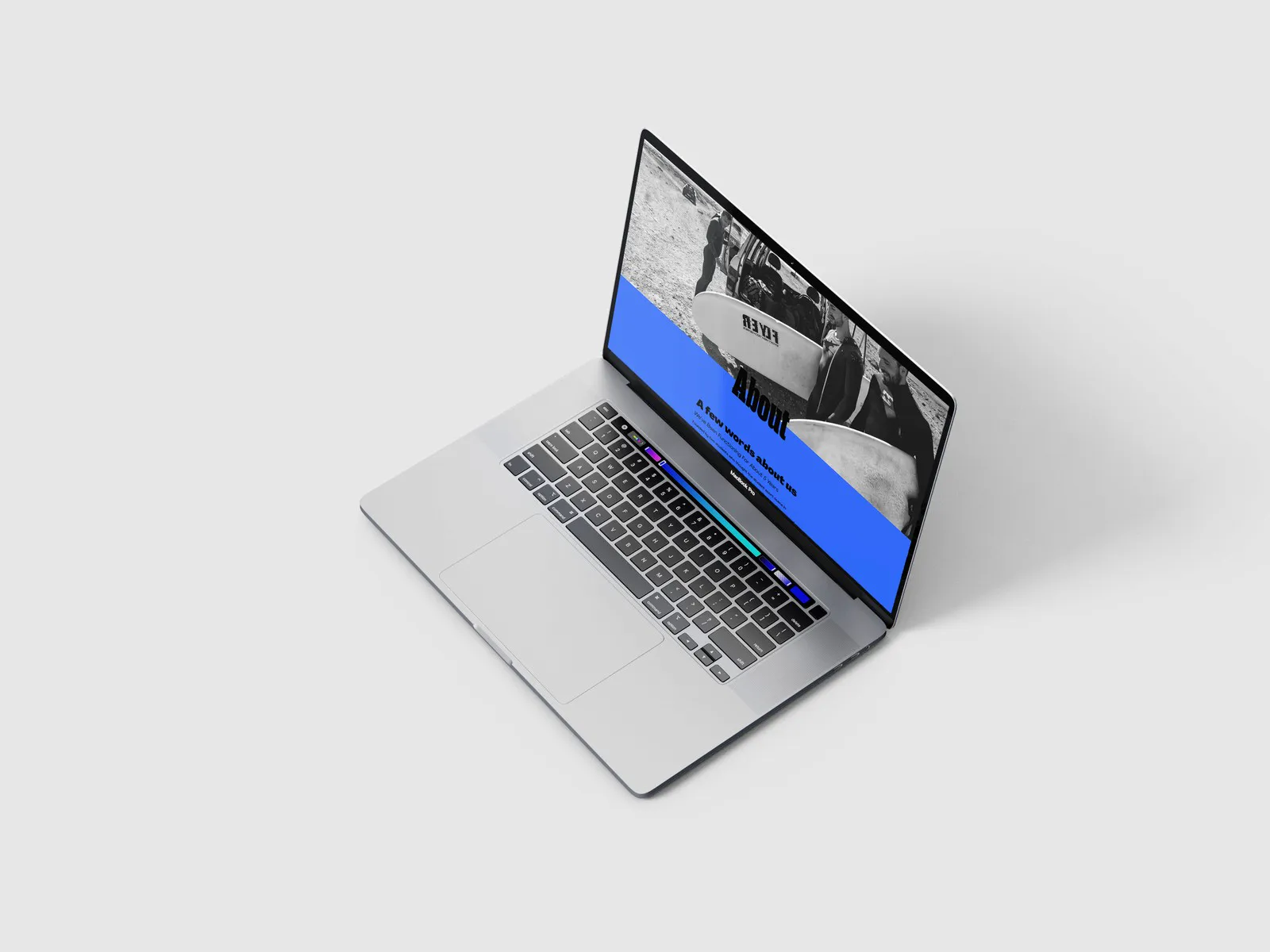
A new identity for a surf, skate and snow brand from Maastricht: logo, colours and campaign visuals that carry the stoke across every touchpoint.
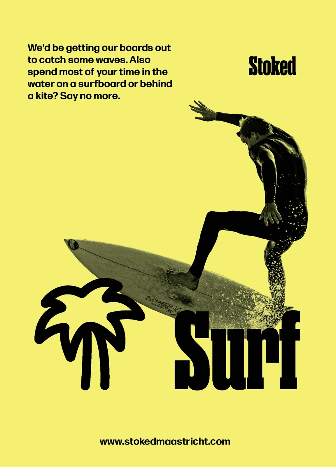
Surf
Riding the wave of a fresh identity: a bright yellow that carries the energy of the ocean and the sun, made to pop on any feed.
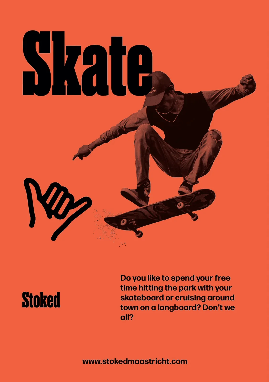
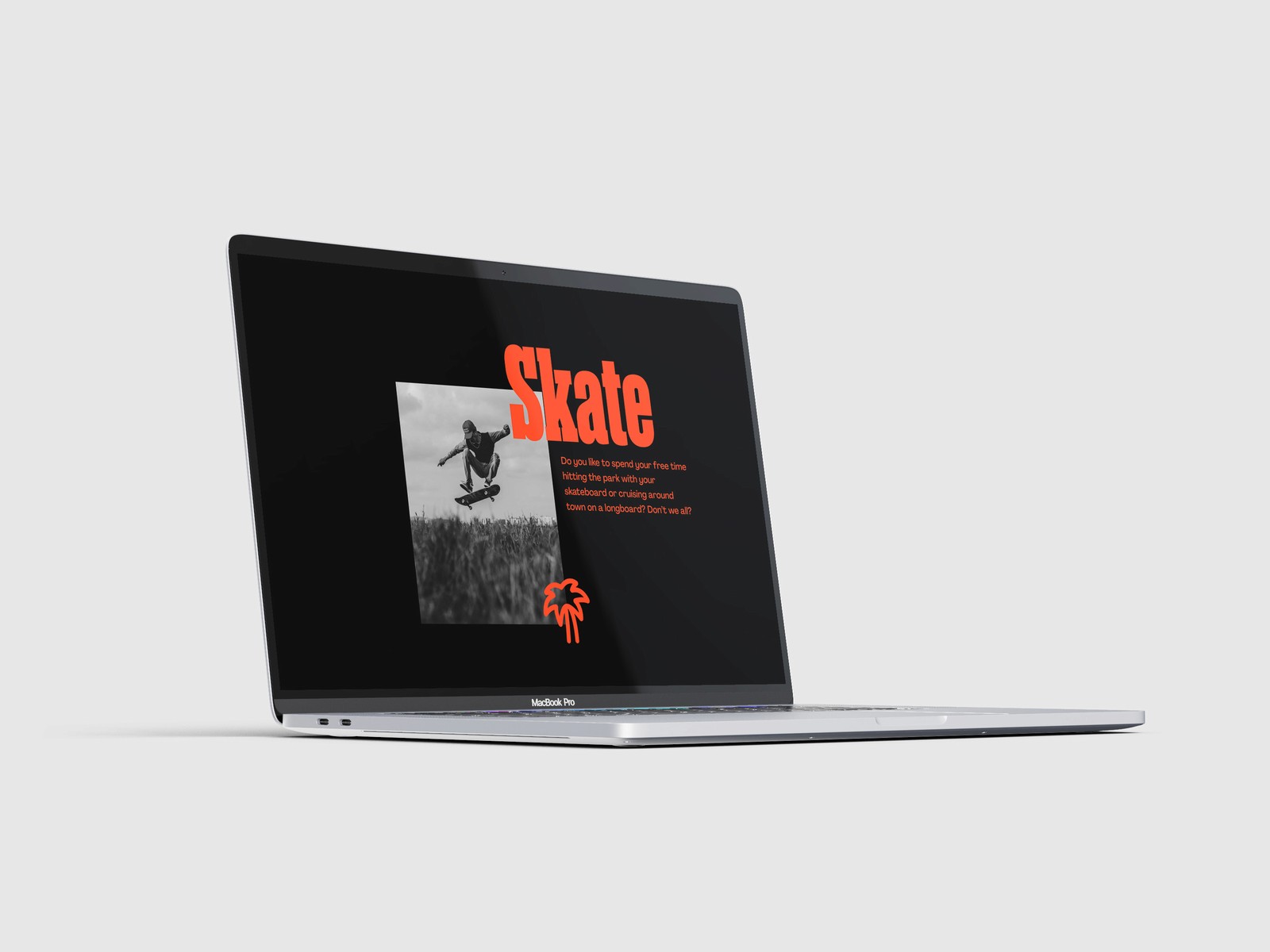
Skate
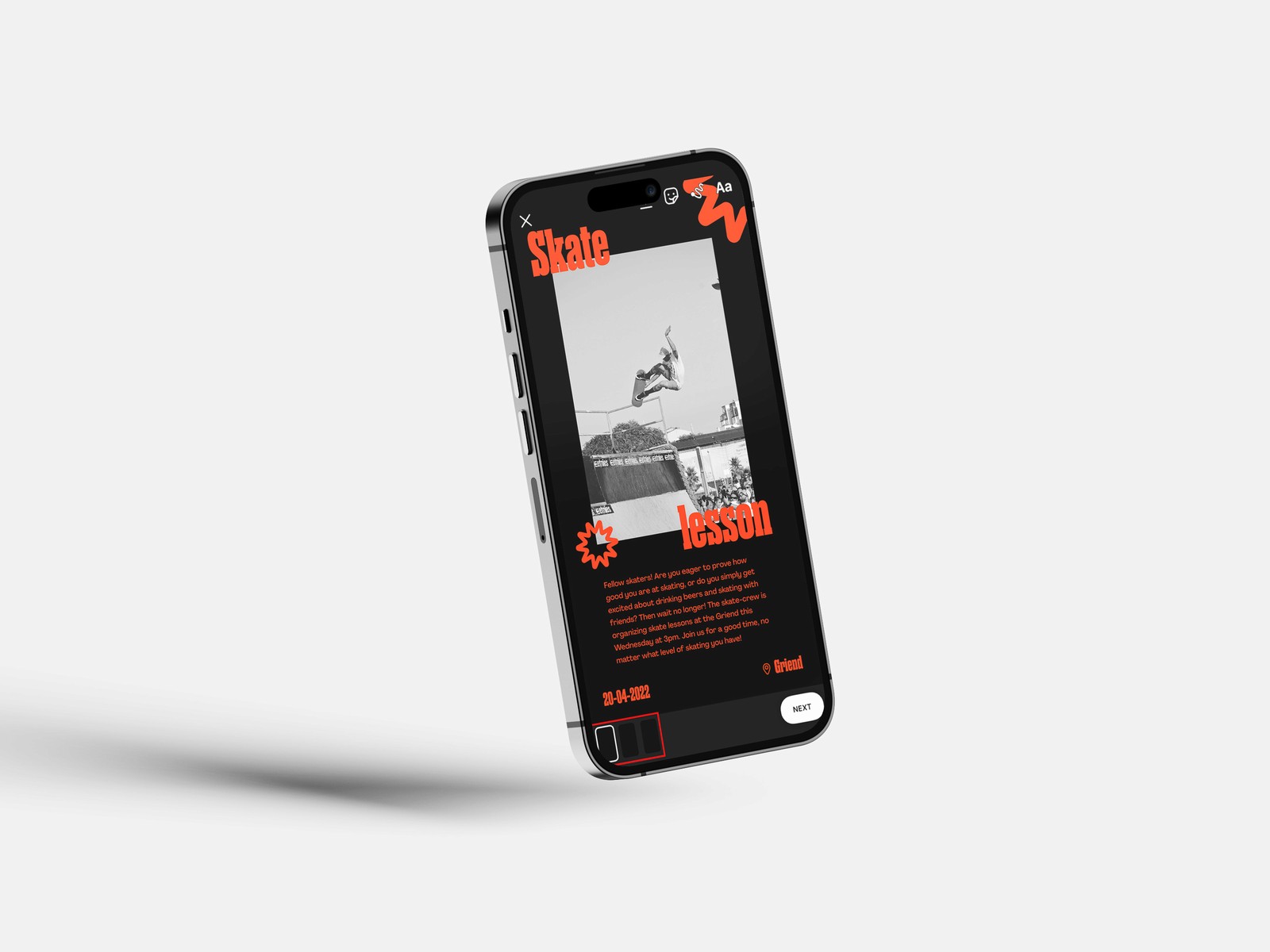
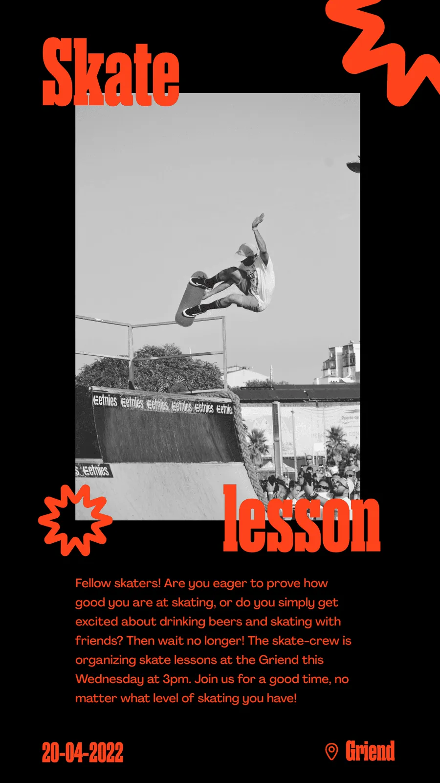
An allrounder in motion: bold orange accents with a street attitude, bringing the brand from the bowl to the poster.
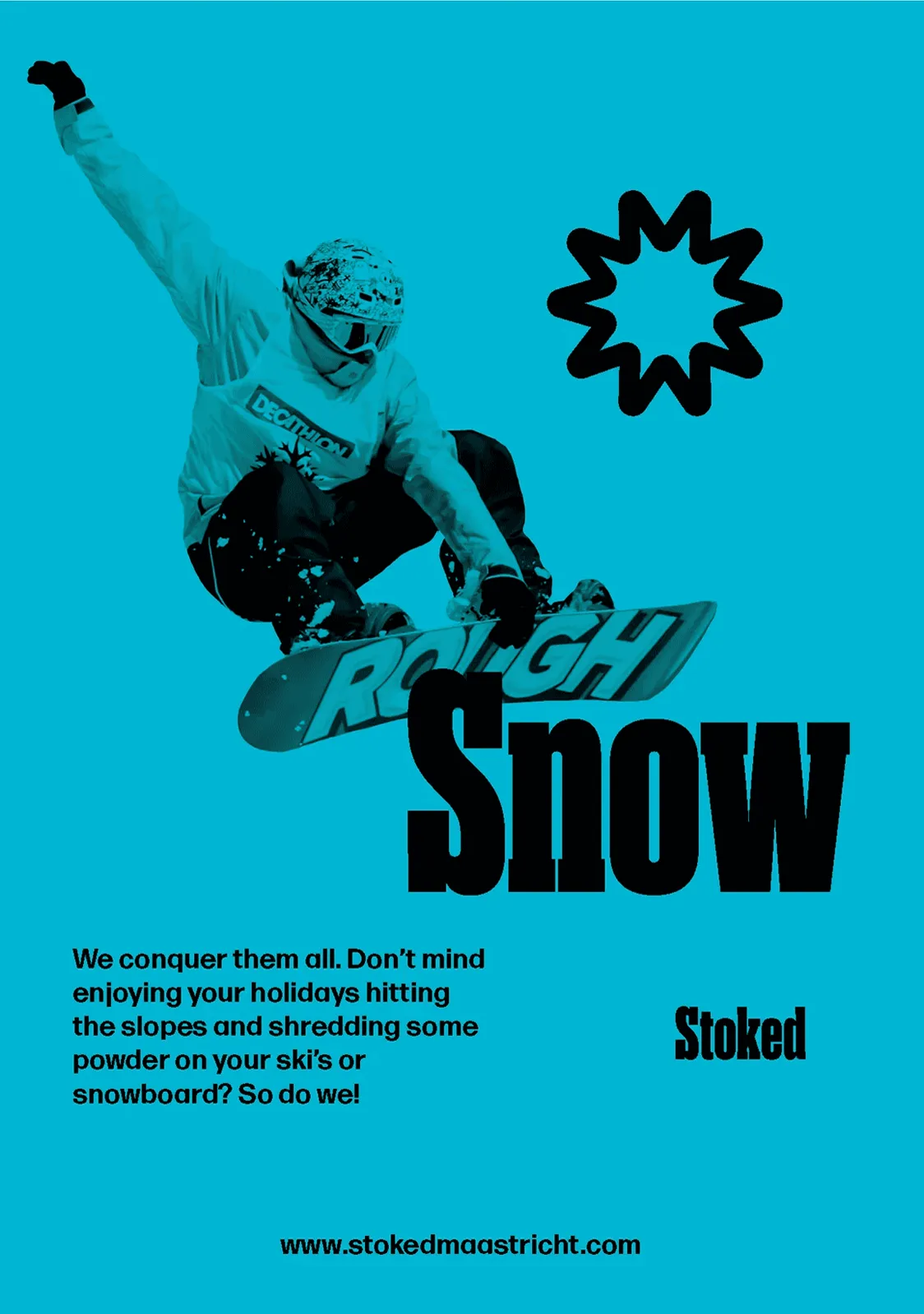
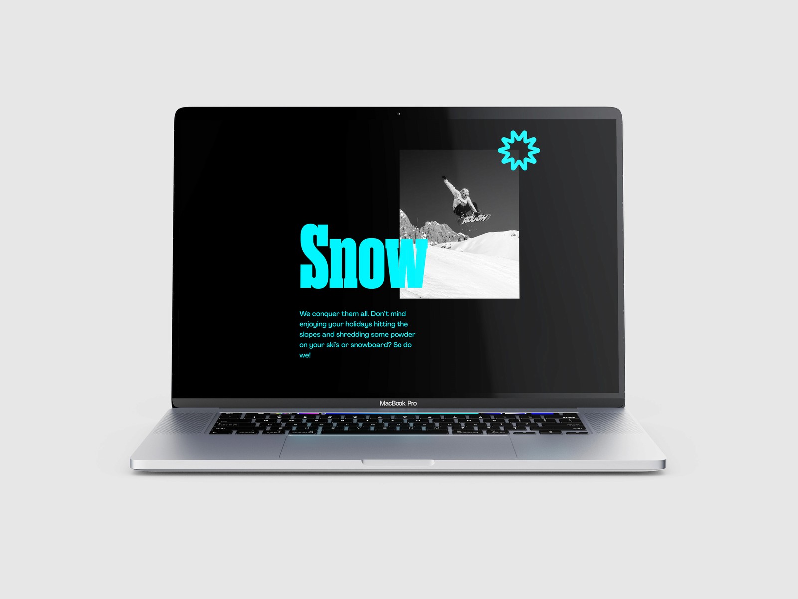
Snow
Crisp and cold: an icy cyan that keeps the identity fresh on the mountain and everywhere the community takes it.